Product

Product FTW

Could not agree more with this post by Fred Wilson. One of the things we told PMs at eBay is “You are the CEO of the product”. It is great training to become the CEO of the company.

It’s not really different from what we look for in startup founders. Most of the time, the founders we back come from product backgrounds. They have a track record of building and shipping products. They are technical and can go toe to toe with their engineering team. They understand where technology is headed and they understand how software products are made and evolve.

When young people tell me they want to start or run a tech company, I always tell them to go work in product at a big tech company. I believe that product is the heart and soul of tech companies, it is where it all comes together. You can’t build a great company without great products (or great people).

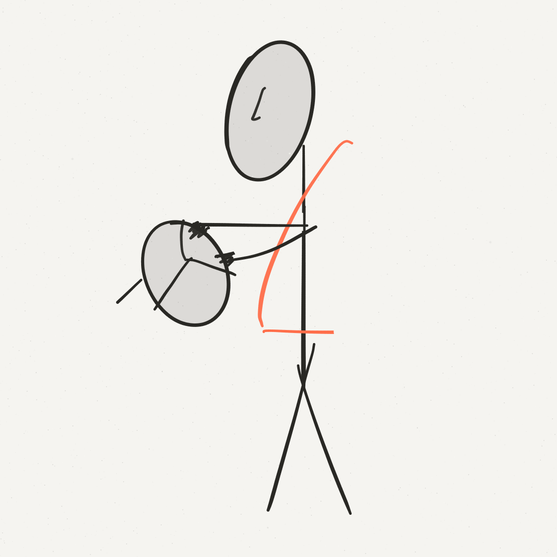
Standing and driving

I’m bought into the whole standing and working thing. I don’t do it enough, but sitting hurts my back and I feel better when I stand.

While this is starting to be a fixable problem in the work environment, one place where there is no alternative is the car (or any kind of transport). Why can’t we stand and drive?

standriving

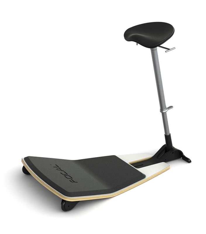
Or how about seats like this where you are sit-standing? Even this, would be a huge improvement over the one option we have today.

Focal-S-2

Cars would get taller, yes. That’s bad for aerodynamics, so the designs would have to change around them.

The only other alternative is where you are almost reclining, like a race car driver – but I’m not sure people want to crawl into their cars.

I hope someone in the car industry is thinking about this as they rework most of the other things about how cars and transportation work.

*Image of standing driver made in Paper by FiftyThree
*Sit-stand seat is the Focal Seat

Use the best, even if it’s a competitor

Experts and developers say that is in part because the Android Market, the dominant store for Android apps, has some clunky features that can be annoying to phone owners eager to make a quick purchase. For starters, Android uses Google Checkout rather than an online payment system that more people are familiar with, like PayPal. As a result, many Android developers make their apps available free and rely on mobile advertisements to cover the cost.

In large companies, when a team is building a new product, there is often pressure to use other products/services offered by the company, even if they are not the best products in the market or the best user experience.

That is a mistake.

Google’s Android Marketplace product and development teams should build the best product they can. For the checkout component, they should use the best product out there – the one that guarantees the best user experience.

Internal and external products should be treated the same and allowed to compete for the right to be part of the product. For example, if PayPal is the best product, they should use PayPal for checkout. This puts the onus on the Google Checkout team to improve their product – it forces them to be competitive and up to scratch. It ensures that the Google Checkout team is never complacent, never just expecting to be slotted in just because they are a part of Google. It forces a startup, competitive mindset onto the team.

This open, competitive approach is not easy to do. In fact, it is very hard. There will be a lot of voices that say that Google should push Google Checkout in order to get adoption up – basically, prop it up. It’s almost always the wrong way to go, in this case for the Android Marketplace and if you are willing to take a bigger picture, for Google Checkout as well.

Make me care

Twitter improved their New Follower email last year by adding Followers, Tweets and Following. But they left out one very important piece of information – the Bio. To me, if they had added in that one variable, the email would be perfect. Because then you not only know their twitter usage, but who they are.

By leaving it out, Twitter has made everyone soulless. Follower counts are numbers. Cold statistics that tell me frequency and popularity. A bio gives me flavor. A bio also gives me reason to act.

If someone with 2 followers and 0 tweets is a bio-less person whose name doesn’t ring a bell, I am unlikely to follow them based on the email. But if they are affiliated with a school I attended, a company I worked at, a city I lived in, or if their bio grabs me in any way, I will likely follow them regardless of the statistics.

But I don’t even get that far. Because what happens with me, and likely most people, is that most of the time they don’t even bother clicking through to the web to decide whether to follow or not. Who has the time?

If the bio doesn’t entice me, it is not going to entice me just because I was forced to click through to the web to read it. By leaving out the bio, Twitter is reducing the velocity of interactions, reducing the connections. That’s not a good thing for the service.

People are busy. Good product design should make it easy for people to care and easy for them to act in the moment of caring.

Smooth the flow

I’ve used Google Reader to subscribe to RSS feeds for a long time. Every single time I click on an RSS feed and choose Google, I am presented with this option –


The thing is, that every single time I’ve been presented with this choice, I have always chosen the Add to Google Reader option. So over the course of my usage, I’ve gone through this process about three hundred times, every time choosing the same option. But Google will not learn from my history and do this automatically nor will they offer me a little check box that says “Always choose this option”.

Will doing that involve a bit more product design, some thought on how to let users change this decision in the future, and a bit more code? Sure. But it will also offer a much better user experience for a majority of their users.

When you design products, you should always give the user ways to make the process more efficient. Removing friction is the goal of good product design.

Reuse and recycling

Plastic water bottles and coffee cups drive me crazy since they are such one-time use products. I never buy water in plastic bottles – I have a little metal water bottles and I just refill those.

I was excited to see Fast Company’s article on water bottles which lays out the landscape but also brainstorms ideas on how to change consumer behavior.

Some of the ideas like the Drink Tap Water bottle tops are great in terms of design and functionality. It’s also so easy to carry around by the tap on top. Wonderful.

I also really liked the LUNAR Elements design of a bottle that a consumer returns at the supermarket and it get’s etched with a news headline of the day – over time, the bottle “ages” with more and more headlines. Really cool (check out the article for more details).

I like the design and the thinking, but at the end of the day, I think the change has to be driven by cost and ease. My metal bottle was about $18. Not cheap. But that’s only about 9 bottles of water – something I might have bought in a couple of weeks. So it was worth it.

The next issue is ease – if you forget your water bottle, what are the options but to buy… What if the water companies used metal like soda cans instead of plastic. A thin metal can of water instead of a plastic bottle. I’d buy it.

As a frequent coffee shop visitor, my next pet peeve is coffee cups. I was excited when I saw the Starbucks Coffee Cup Challenge. The idea of rewarding every 10th person who bring in a reusable cup is a great idea – reward for good behavior will likely change behavior.

But for the other 9 people who don’t bring in a reusable cup, what’s the alternative? The cup itself doesn’t bother me so much because it’s in paper, but what bothers me is the lid.It’s entirely in plastic. Do we need the whole lid to be plastic? What if just the area within the red rectangle was plastic – the area where a customer’s mouth touches the product and where the hot liquid touches the bottom of the up. The rest could be heavy cardboard couldn’t it? At least that way you’d eliminate 60% of the plastic…

And the cold beverage cups at Starbucks? Entirely plastic with a huge plastic dome of a lid to accommodate the whipped cream. Total disaster. Why can’t cold beverages be in paper cups too? Am I missing something here?


Image of Drink Tap Water – All rights, Fast Company

Image of Starbucks Lid – All rights, Rantwick

The carcinogen-free store

In the past couple of weeks I’ve had several people say to me “Is it me or am I hearing the term cancer more and more?” Knowing a clutch of people who have or are dealing with the big C, I’ve had the same thought in my head for the past several months.

What’s going on – is it our lifestyles – what we eat, how much we sleep, how much we drink? Is it environmental – the chemicals in the everything, the air we breathe? Is it that diagnostics are getting better – technology is catching tumors that might have gone undetected in the past? Is it that I’ve reached an age where my friends are just entering the zone of risk and the parents are firmly in the risk zone?

It is probably a combination of everything.

But as I think about what I can control, I would love to be able to consume “safer” products. Of course every product is made of chemicals and not all chemicals are bad, but we know there are some which are or could be carcinogenic. I’d like to avoid those.

The only way for me to do that right now is to read a ton, educate myself on which chemicals are dangerous and then read every single label to ensure it doesn’t contain any chemical on that list.

But there has to be a better way – couldn’t there be a store that did this research and only carried the products that fell within the bounds? Since I’d want these safe products in every category, it would have to be a really broad selection – cooking utensils, clothing, accessories, etc.

Think of Amazon, but with a layer on top of it “carcinogen free (CF)”. This entity would do the research and identify the products in several categories that are safer. It then sets up it’s CF Store. All the items are on Amazon, this is just the CF Store’s selected short list. When a user shops at this store, the transaction is completed on Amazon and the CF Store gets a cut. There are no guarantees with this stuff, so the CF Store would do a to-the-best-of-our-abilities thing. But that’s a heck of a lot better than what I can do right now.

The CF store doesn’t just have to be the CF Store alone. It could also be the CF and Green Store that also picks environmentally friendly products. That would just be another slice of what’s available on Amazon.

Or what if on Amazon itself, there were filters- CF, Green etc., in addition to the Brand, Material and Color filters that already exist. I do a search and check the filters that are important to me. As I check more filters, the number of products reduce, but hey, I’m willing to deal with less choice for being more picky.

Does something like this exist? If it does, let me know and sign me up.
Tumblr – users want more control

This was a comment on Rob’s blog that I decided to turn into a post…

Good products are simple for the majority of users with more complex features for those who need it. I’ve always believed this.

And in this I see the fundamental drawback with Tumblr.

It has a wonderful UI and is easy to use. But it is so because of the limits they have put on it. Adding widgets is hard. Plugins couldn’t exist till recently. Good in some ways… but truly good UI is the ability for the user to customize. Simple is the default, but you have to be able to make it more customized (or complex) as needed. And this last part is what Tumblr is missing. Big time. It is a huge issue (for me, anyway).

Reblogging is such a great idea. But it is only available within Tumblr blogs. Could Tumblr figure out a way to let you reblog from any blog? Sure they could – they are smart folks. But it wouldn’t be as easy or as pretty. So no one can have it. That’s an issue. Why not make the standard reblog easy and as it is and then why not offer an option in the dashboard that more advanced users can turn on that will allow reblogging from anywhere?

The exact same thing is true with your suggestion, Rob – the ability to see any blog in your dashboard rather than just Tumblr blogs. Is it possible? Sure it is – just grab the site’s RSS and present it nicely in the dashboard. For the basic user, they can only see Tumblr blogs they follow, for the advanced user, an option should exist to see other blogs.

Tumblr’s biggest drawback is that it mandates how users will use it. Dictating how your users can use something by not enabling customization is not a great way to ensure simplicity. Open does not have to be complex and ugly. And the smart people at Tumblr can figure it out.

These are just two examples of how users would like to see more out of Tumblr. Other users will have their own pet requests. For each of these examples, I know Tumblr can give us a great reason why they don’t enable it. But… their users want it – isn’t that what’s important? Tumblr needs to allow the users to have more control in how they use the platform.

I’ve been wanting to write this post on Tumblr for a while and your post prompted this long comment!

Originally posted as a comment by Shripriya on Why Didn’t I Think of That? using Disqus.

Give away stuff that makes your product easier

I bought a big jar of hand cream a while ago. I love it – it works great, it smells good, my hands always thank me.

But it comes with a screw-on lid. Not a big deal, right? I thought so as well. But I noticed that the jar has lasted me a long, long, long time.

Last week, I ordered more cream to put around the house. One of the options was to order a pump lid for an extra $1.50. I wasn’t sure it would work since the cream is really thick, but on a whim I decided to try it.

Two days after I screwed on the pump lid, I’ve gone through the rest of the cream and have transferred the pump to a new jar.

Happy Pump Lid

Amazing how something small like that can increase usage so dramatically. I think back as to why the old jar lasted me so long – it was because there was always an easier option around – a tube with a pop lid, a dispenser, something that was easier even if it wasn’t as good.

Imagine being the producer of a great product, a product that was clearly superior to everything else out there, but it was always a second or third choice because of how it was packaged and dispensed. The packaging and the dispensing is the user interface for the cream. And it was really holding the core product back.

If the cream manufacturer had given away the pump lid – something that probably cost less than 50 cents to manufacture – I would have gone through three jars instead of just one in the same time, increasing revenues and customer satisfaction at the same time.

When you build accessories/add-ons that make your product easier to use and increase usage, give that stuff away like candy! Your main goal is to get people to use and love your product. Anything that makes that easier is only a good thing.