
When I finally read this “Taste Is Eating Silicon Valley” post, it reminded me of some notes I had made a year ago under the heading of “Focus on the feeling.” A slightly different take on the same big-picture theme —>
When I watch a film, I focus on the feeling: how do all those elements come together to make the viewer feel?
Functionality (plot, dialogue, acting, costume, camera angles, lighting, locations) matters. But that’s table stakes. There’s a big difference between a synopsis that you could read on IMDb and a film that’s complete with the things that makes the story come alive.
The nuances of the execution of the film matter. It’s in the little details that define the character and the world, the scenes that release tension and make you laugh (even in a tragic story), and how the viewer is carried along on the journey.
A good film doesn’t have to twist your arm to carry you along.
During some films, I feel light, hopeful, filled with possibility. For the protagonist, and also about the world. After some films, the weight of the film stays with me. I leave thoughtful, aware, and perhaps a little sad.
Tech products can have the same effect. In 2013, I used HipChat to communicate internally. It was fine. It was functionally complete and did everything we needed it to do. And then Slack came out. The functionality of HipChat and Slack were so similar, and HipChat had an entrenched user base. Why, then, did Slack pull away and take the lead?
It was the choice of color, fonts, and interaction elements that created these “feelings.” When I tried Slack, it made me feel light, happy, less stressed. HipChat, in comparison, felt formal, almost stifling with blues and grays. There were also key product decisions on how you could start using Slack (easily), and onboard your colleagues (easily) that were heavy contributors. But, in order to even want to use it and get your colleagues to use it, you first had to fall in love with it. And love it enough to get everyone to move to a new platform. The feeling of joy and lightness was so significant that it caused mass adoption of Slack and mass abandonment of HipChat.
A good product doesn’t have to twist your arm to carry you along.
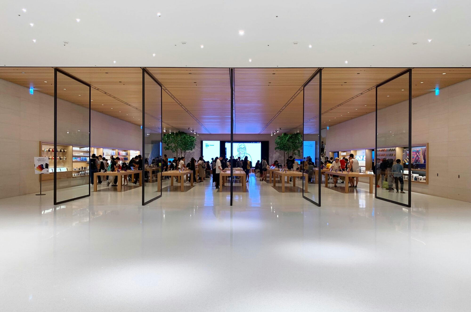
Same goes for the Apple Store vs. Best Buy. One draws me in, encourages me to be in my own bubble (even if the store is crowded), and look at and explore delightfully beautiful products. The other feels cluttered and overwhelming, even if it’s empty of visitors—and even if they’re also selling Macs and iPhones. Instead of products, I get to see aisle after aisle of boxes – a well-lit warehouse. Even the shelves – ugh – such a lack of care for the products they display. It’s an experience I avoid if I have a choice. These feelings of drawing in and repelling are a huge part of the design and care (or lack thereof) that each retailer has chosen.
Another example is Turo1 versus airport-based car rentals. With Turo, you rent a car from a real car owner, you know exactly what the car will be, you meet the person who owns the car, and you have a warm, more-personal experience of delight for a car you actually want to drive. Turo focuses on the feeling, through the design of the customer experience from booking, to delivery, to the rules around having to clean the car (you don’t!), to return.
You want your customer feeling: That was awesome! Now I’m in a good mood. It makes me lean forward and want to do this again. Behind that feeling are the many careful decisions that make the process delightful.
In tech, there is a big difference between the functionality—”allowing users to communicate inside an organization”—and the details of how they do it, the feeling they get when they’re onboarded, the joy of a shared gif that gets the “room” laughing.
Focusing on the feeling is what will truly separate the winners.
Disclosure: I am an independent director on the board of Turo. ↩